In this new post I have created a brand identity for new cosmetics.
I have designed a logo, created a brand name in addition to creation of advertisement for this new lotion.
I have used Adobe Illustrator, Adobe Photoshop and Adobe Dimensions.
I have established the logo as shown on the first image. With the type and the colours established I could proceed to creating and developing colours more including creating more logos as I wanted to create three different types of lotions.
With colours for each fragrance set I could proceed to developing a design for each bottle.
With this done I could export the individual assets and put them on real packaging.
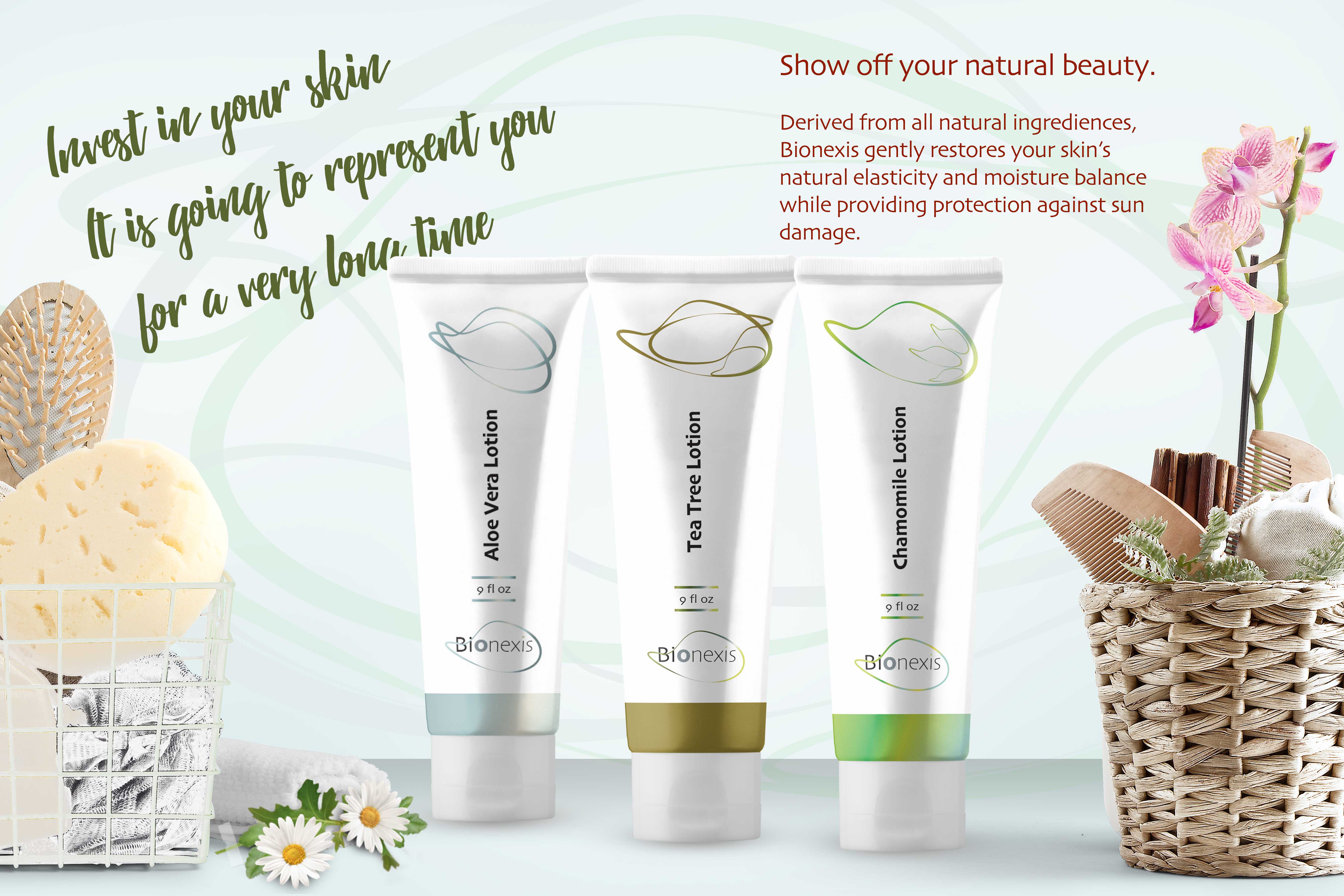
My final step was to create for an advertisement for a magazine.


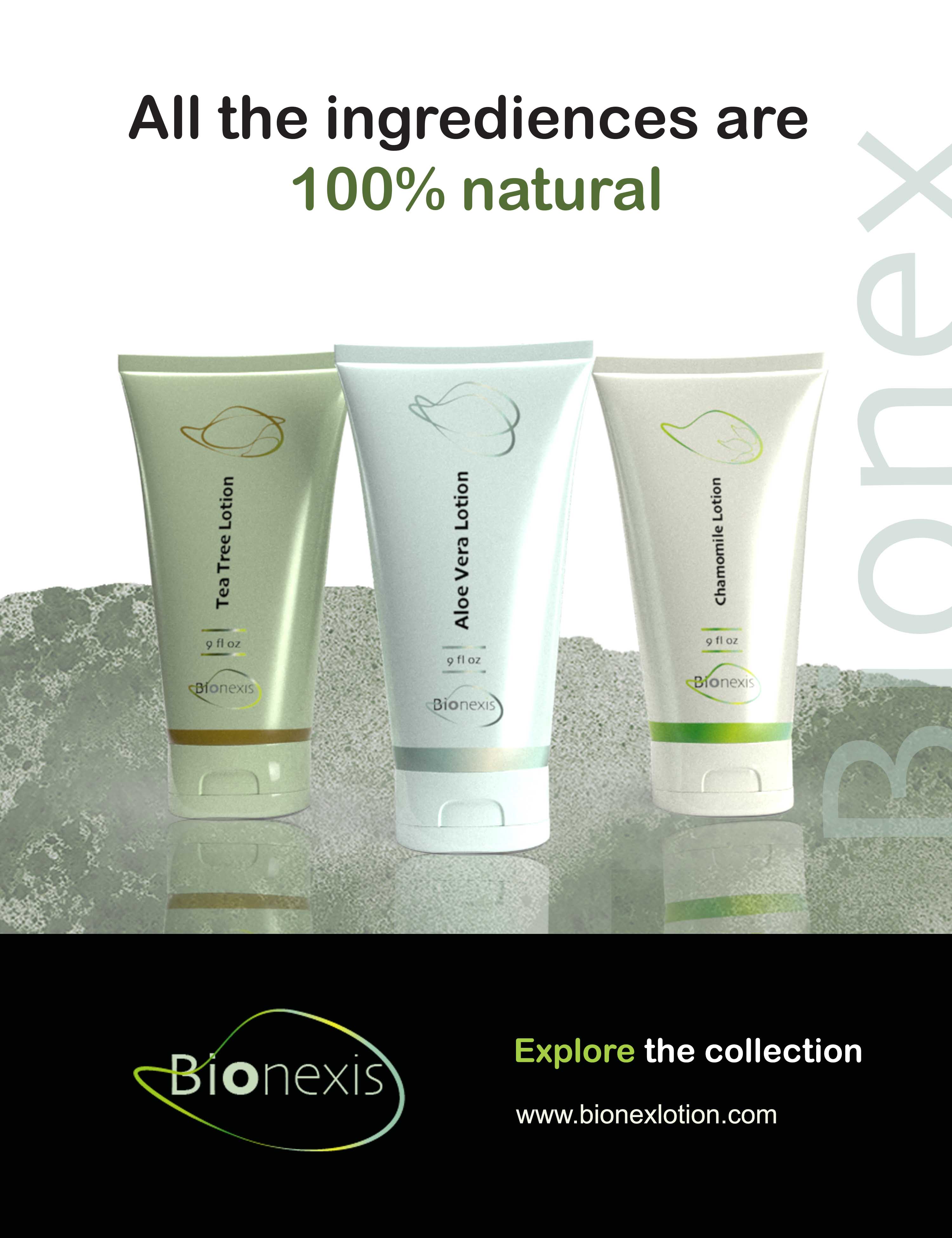
The idea was to create something very clean. I felt this product doesn’t need anything too bold as the target audience is between older generation wanting a good quality product instead of something flashy and shiny.


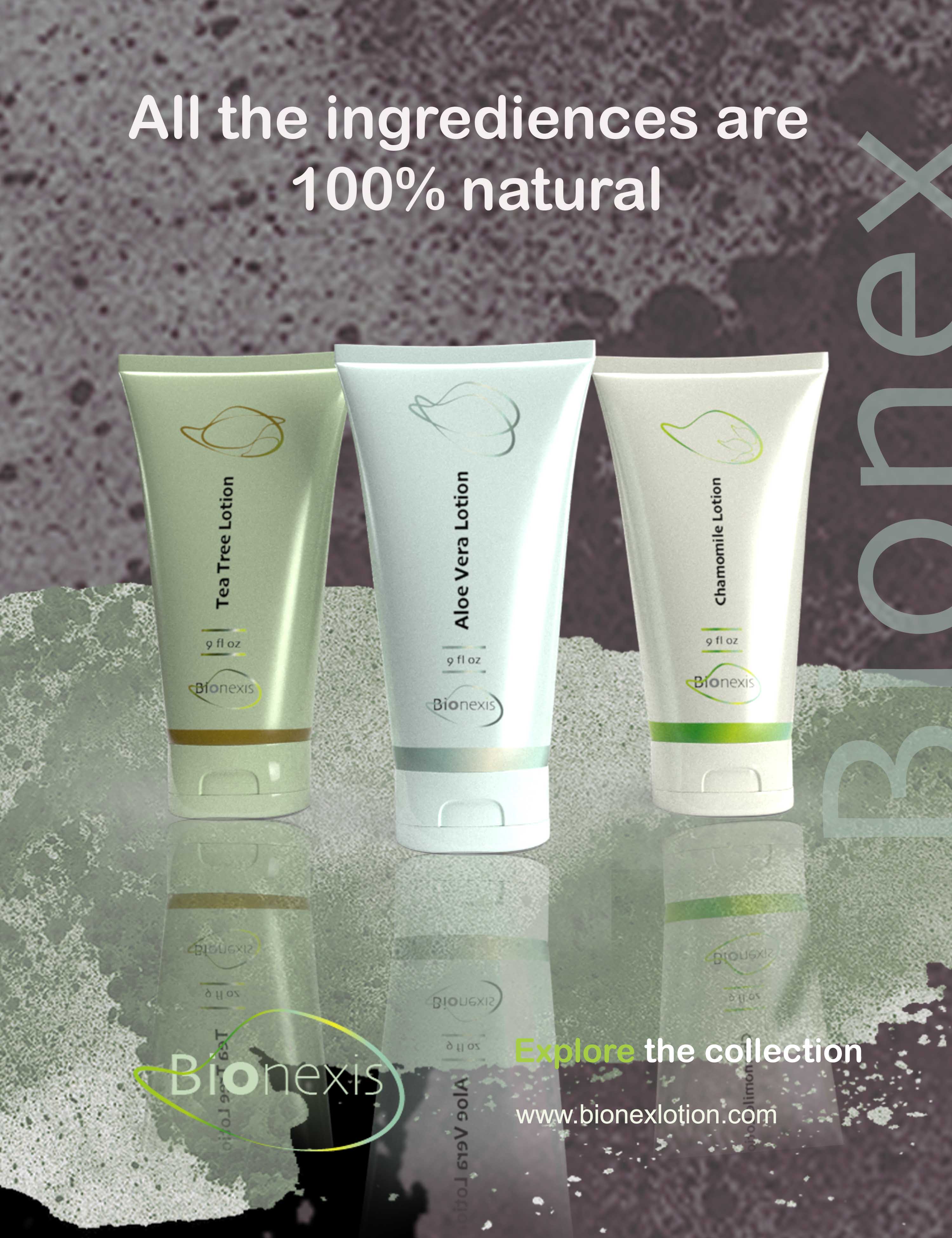
The last advert is more for a magazines or something like that.

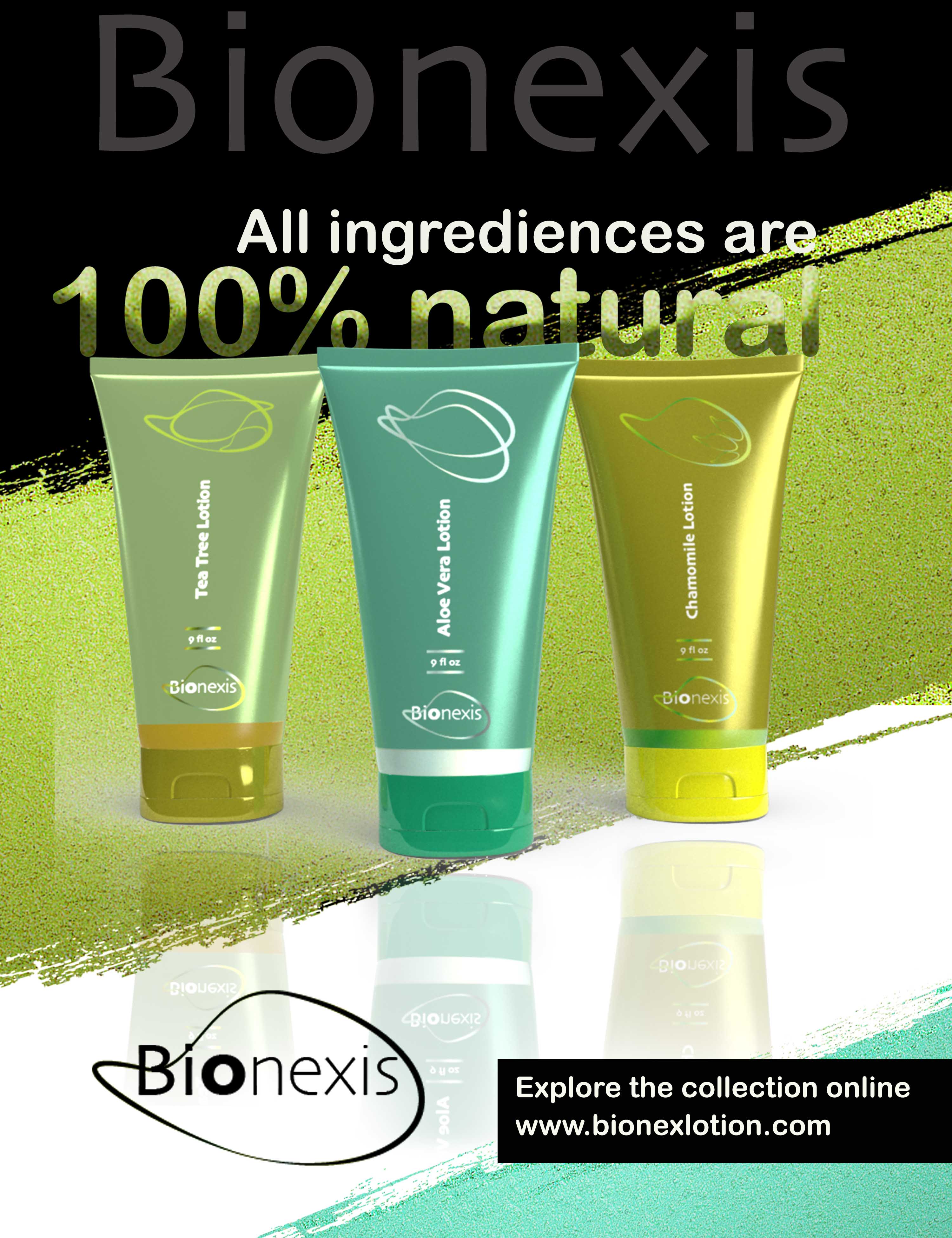
After some consideration I have realised the colours of the lotions are bit too muted and uninteresting. Such product wouldn’t be able to attract much attention.
For this reason I went back to Adobe Dimensions and made the colour of the packaging few shades darker. The images below are showing the results of this change.
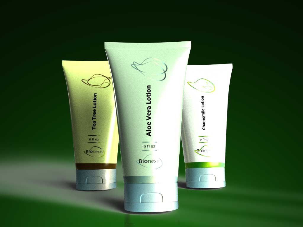

This attempt didn’t make much of a difference, therefore I knew I have to make the tubes darker.
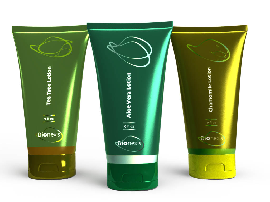
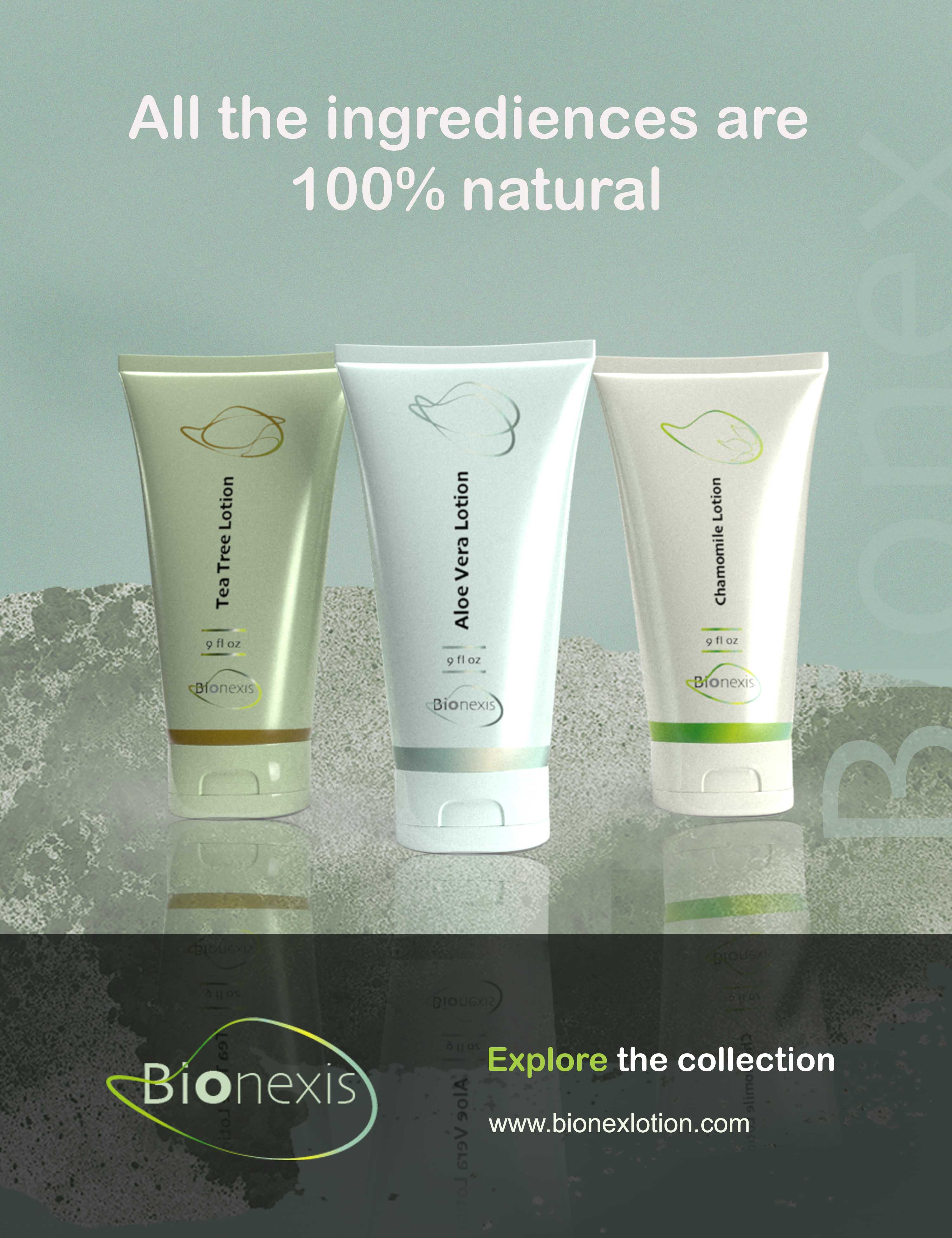
With this result I was much happier.