
For this post I have decided to design a can for sparkling fruit drink. What I had in mind was something with a flair of joke.
My idea and big mission to remove the boredom and stigma that surrounds soft drinks.
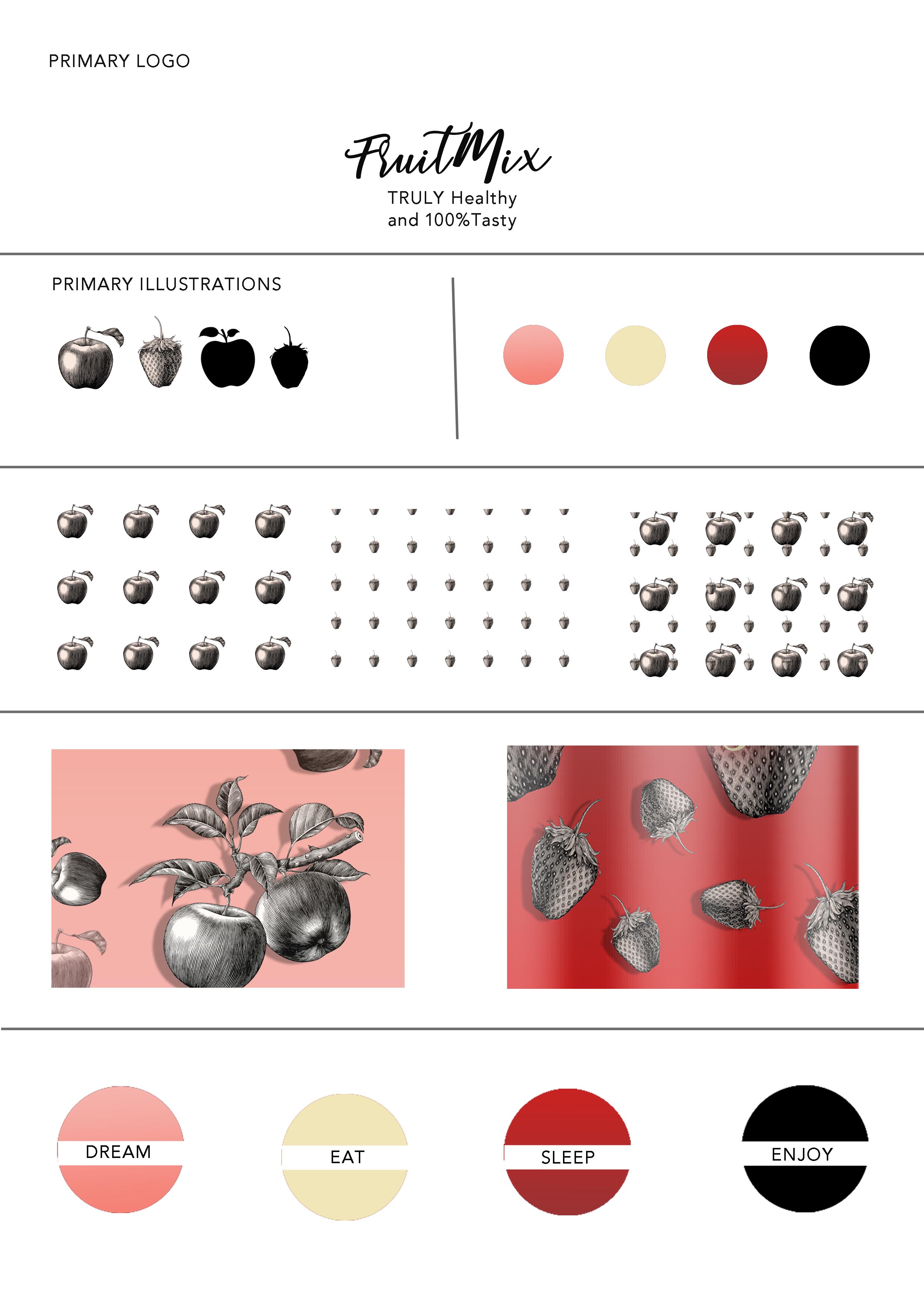
I am continuing with the look of the vintages snack I have designed earlier on and which you can see if you click HERE .
I wanted to use images of the fruit the drink has got a flavour off.


mockups-design.com 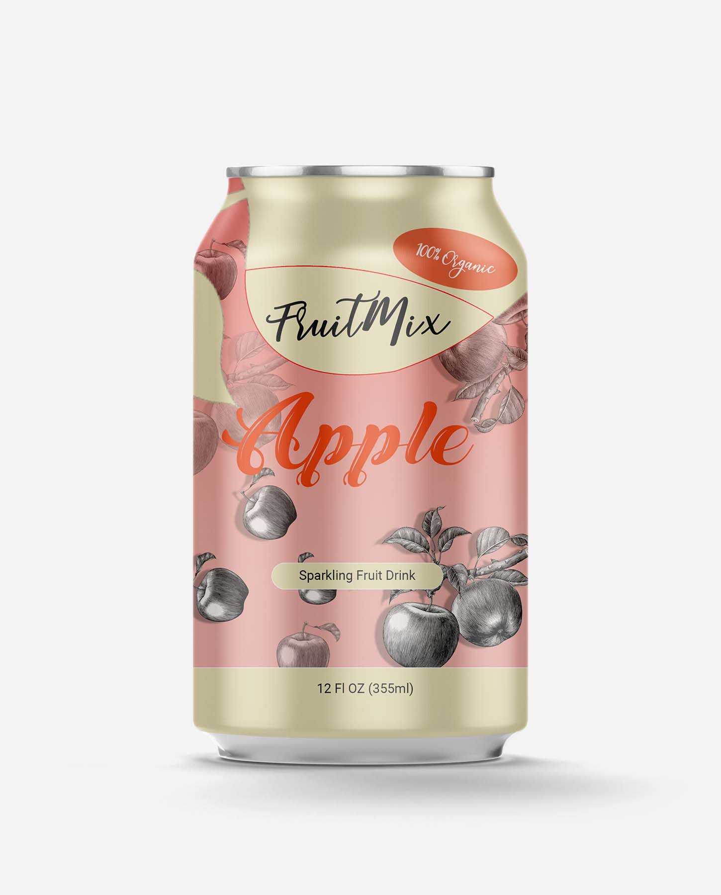
mockups-design.com 
mockups-design.com
I had to bee testing the ideas as every element of the can plays a significant role in overall look of the packaging.
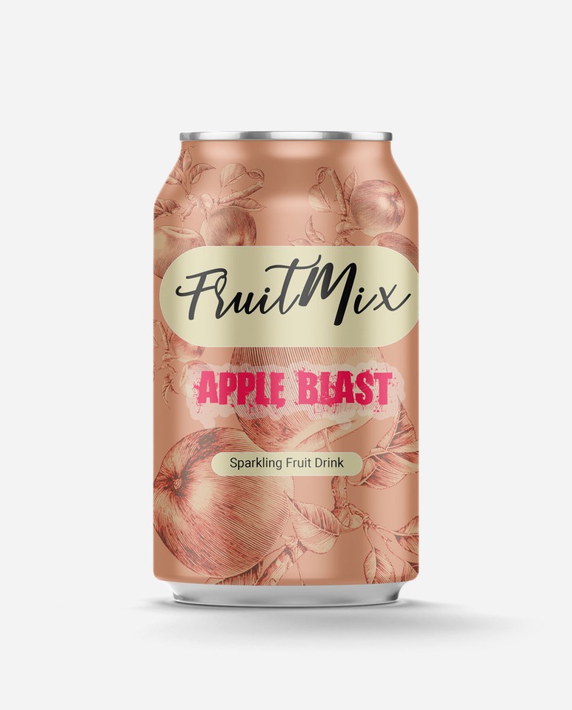
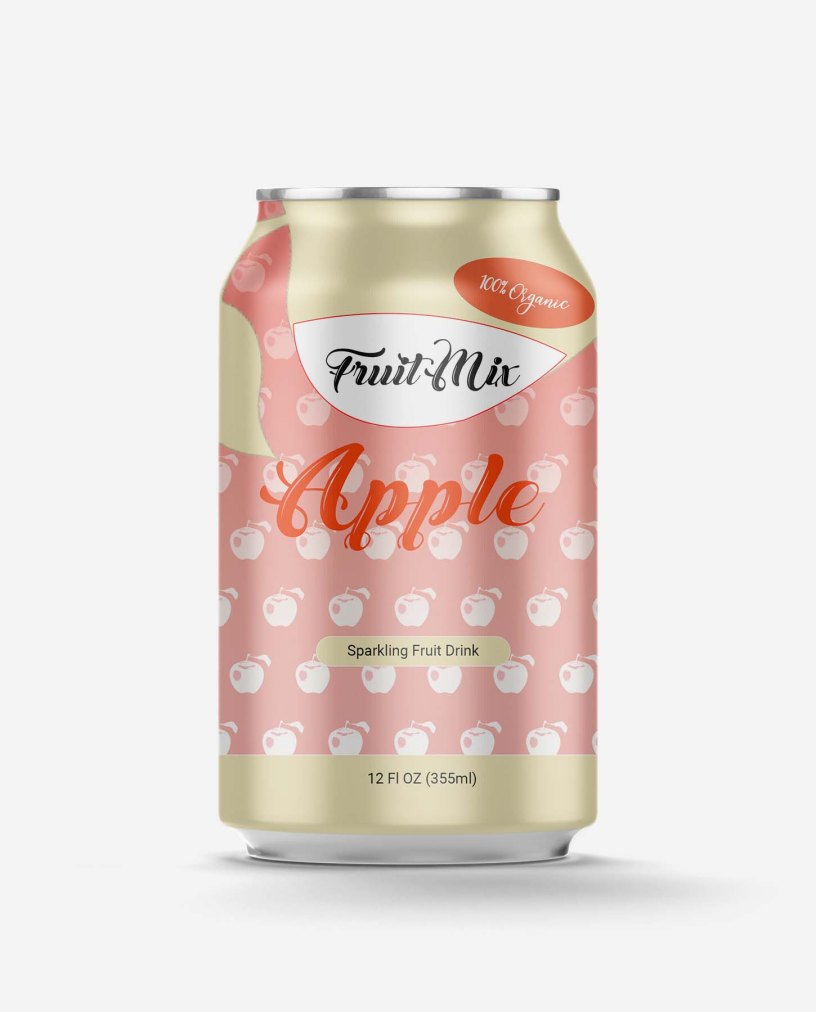
ere you can see my first attempt to do so. Prior to this work I have done some research into sparkling fruit drinks. I had in mind to use font which would complement the idea of tasty drink, but the used font here and the colour too is not working at all.
The drink name is too big and the red colour is disappearing in the background.
I now new I have to be using different font than I have used the vignette should be small too.
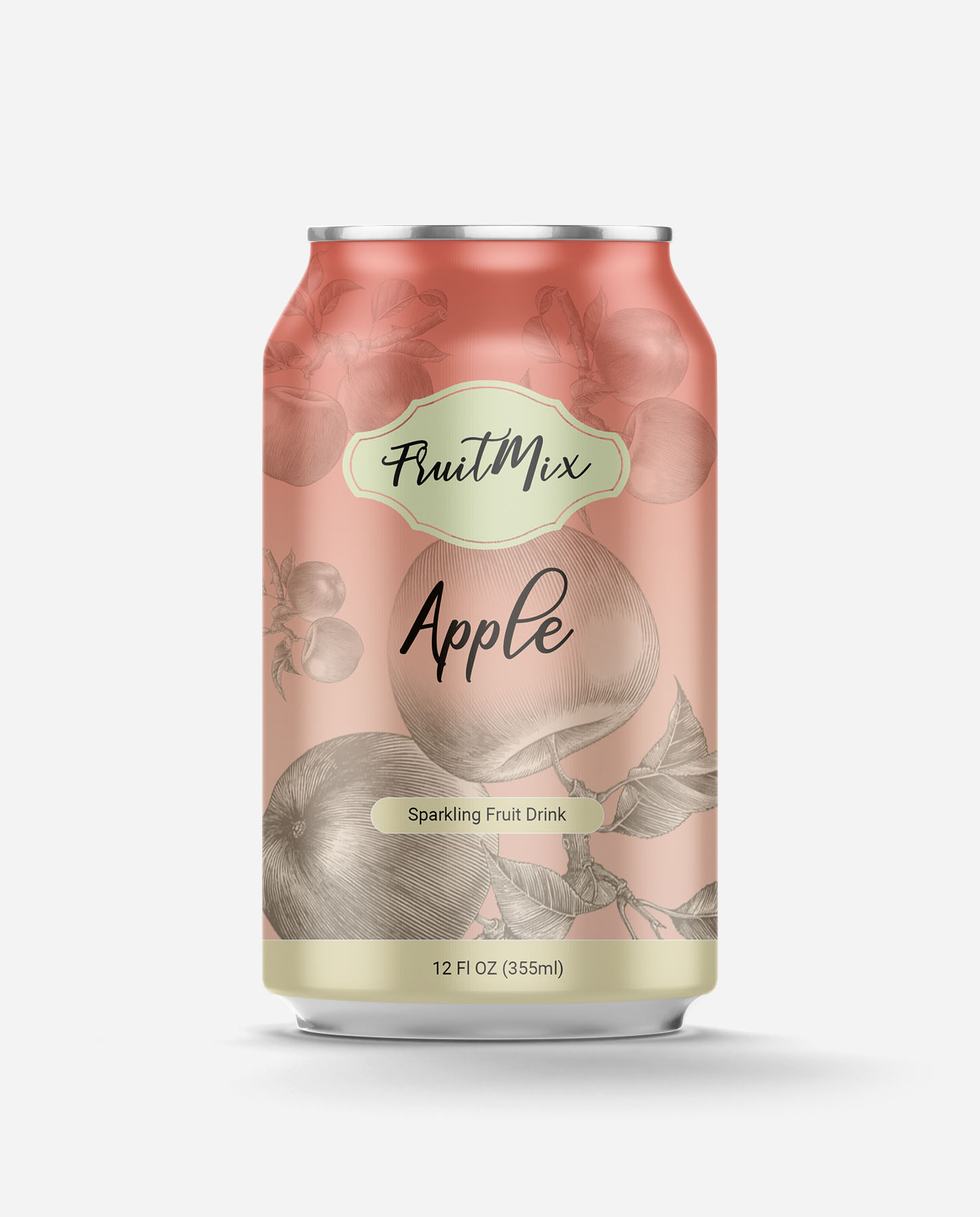
In this example I have used different type of vignette, but I don’t think it work well either.
Customer now know that he/she is getting sparkling drink and knows more about the weight.
I like the colour and the use of the gradient here, but the vignette is not really working here very well.
With this new example I have tried to play more with shape of the label as I wasn’t satisfied with look, because it seemed empty.

In my opinion also not harmonised together very well.
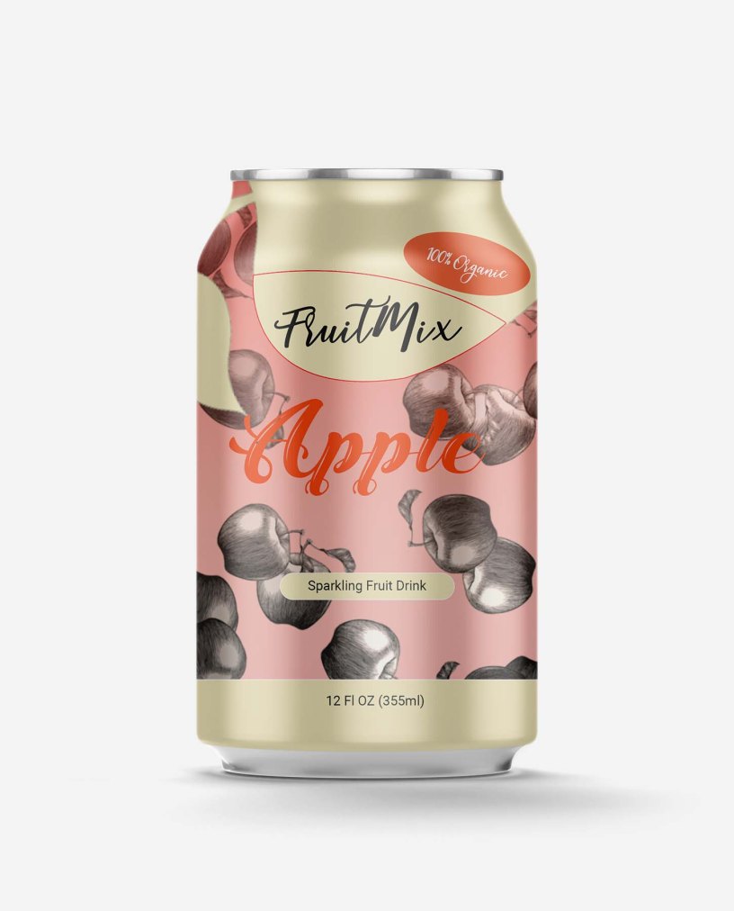
In case of the example on the left I added shape at the top of the can to help me highlight the Brand name as that is important and also the flavour of the drink, plus small information for the consumer that the drink is organic. In the previous exaples the big apple at the background was turned the wrong way around so in this case I have ammended the mistake and turning it the right way around. My consumer knows now and can distinguish the brand name with clean shape at the top.
In the last few cases I have played more with background image and overall look of the illustration.

I feel the image itself is interesting and important too as the shopper can see clearly that they are buying something with apple flavour.
I have decide to change few elements which is adding shadow to the apples and adding more of those I wanted to simplify it for the consumer. Also the flavour label is now white as I don’t like the black, it seems too hard to me.
The reason for playing with the background image is that I had to delete some parts to help the logo to stand out more.
The last example of my collection is a Strawberry flavour drink.

Which in my opinion is the best. I feel this is better executed.

I was trying to follow similiar pattern, but some of the procedures are different.
In the first case I wasn’t using gradient to add more colour.
In the ase on the right I have used gradient and the strawberries are partly hidden by it.
I prefer the first case, because it would be stand out on the supemarket shelf better.

mockups-design.com 
mockups-design.com 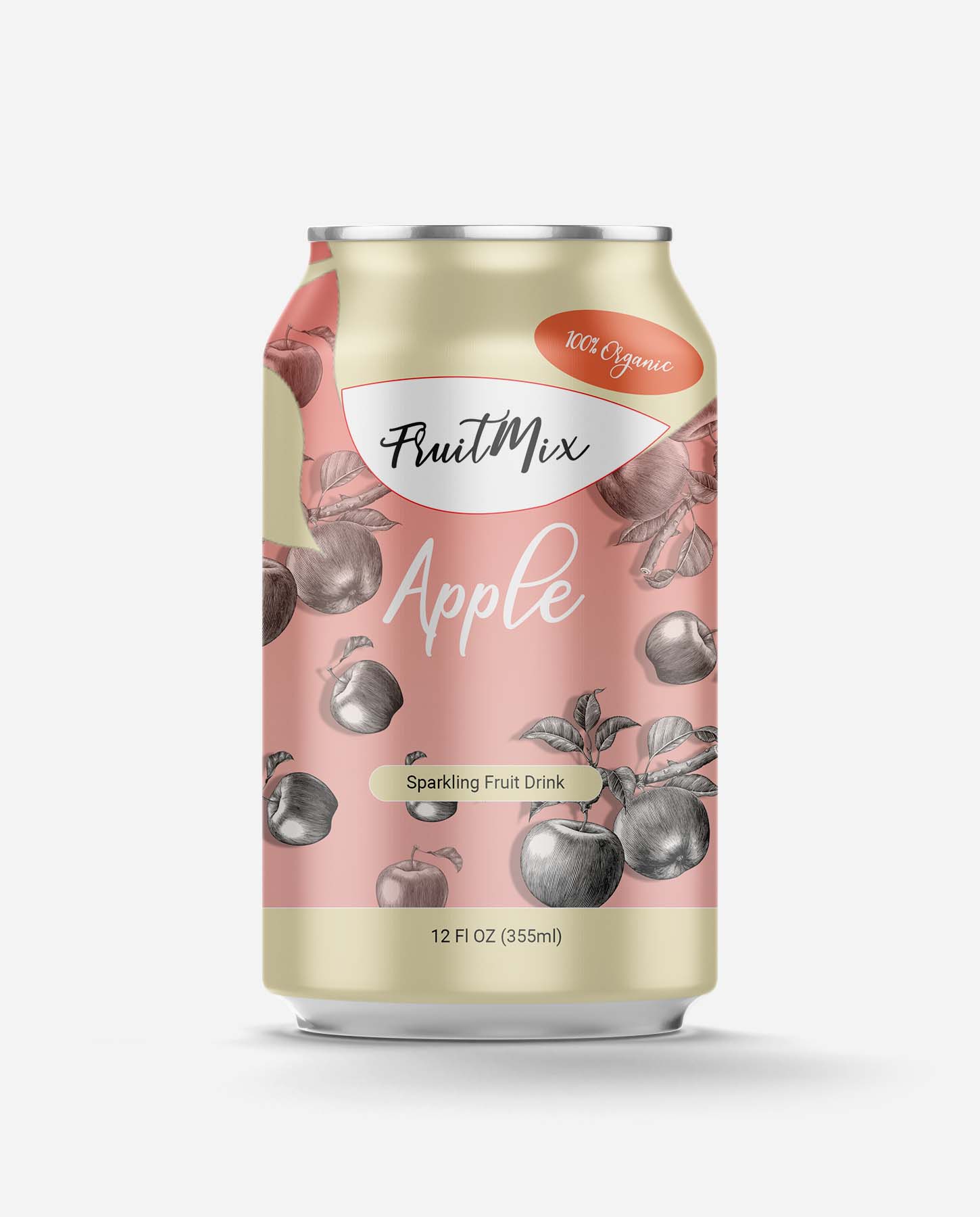
mockups-design.com 
mockups-design.com 
mockups-design.com 
mockups-design.com
