
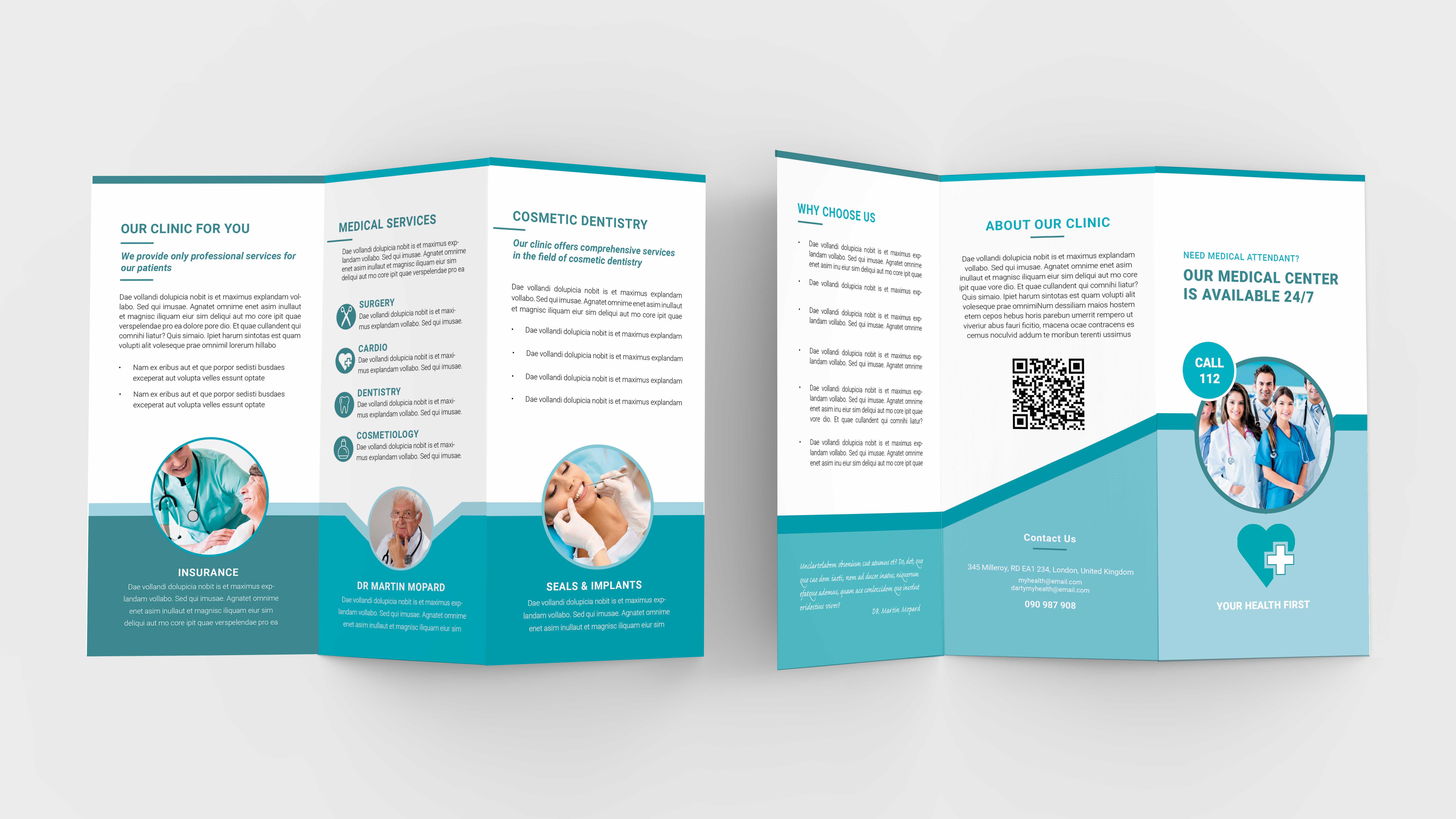
For this post I have prepared a medical trifold brochure to keep carrying on the theme of medical stationary.
We all need healthcare so therefore I think it is important to keep developing a good design to complement it.
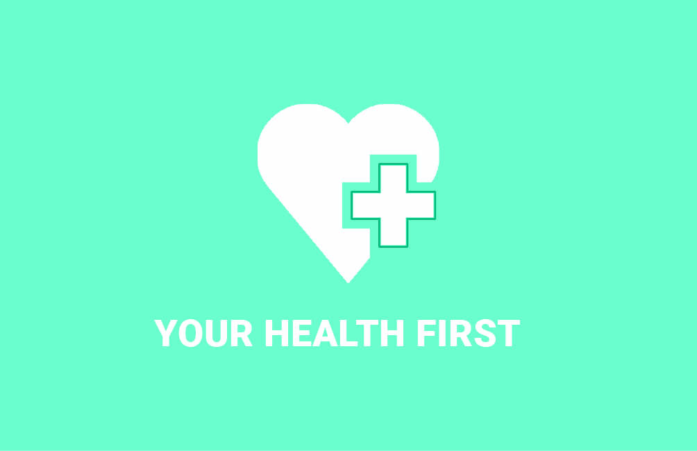
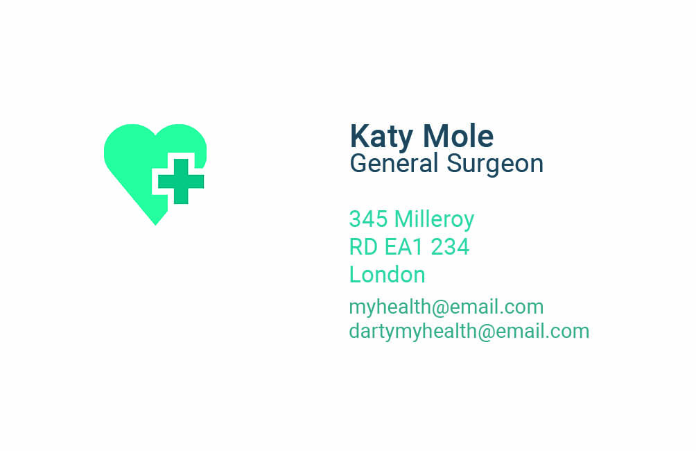
I had to think about the logo I wanted to use. I knew I wanted something heart warming and quite simple. I have decided on a heart which could be used through all the products.
To make the project complete I have also created a business cards and branded t-shirts.
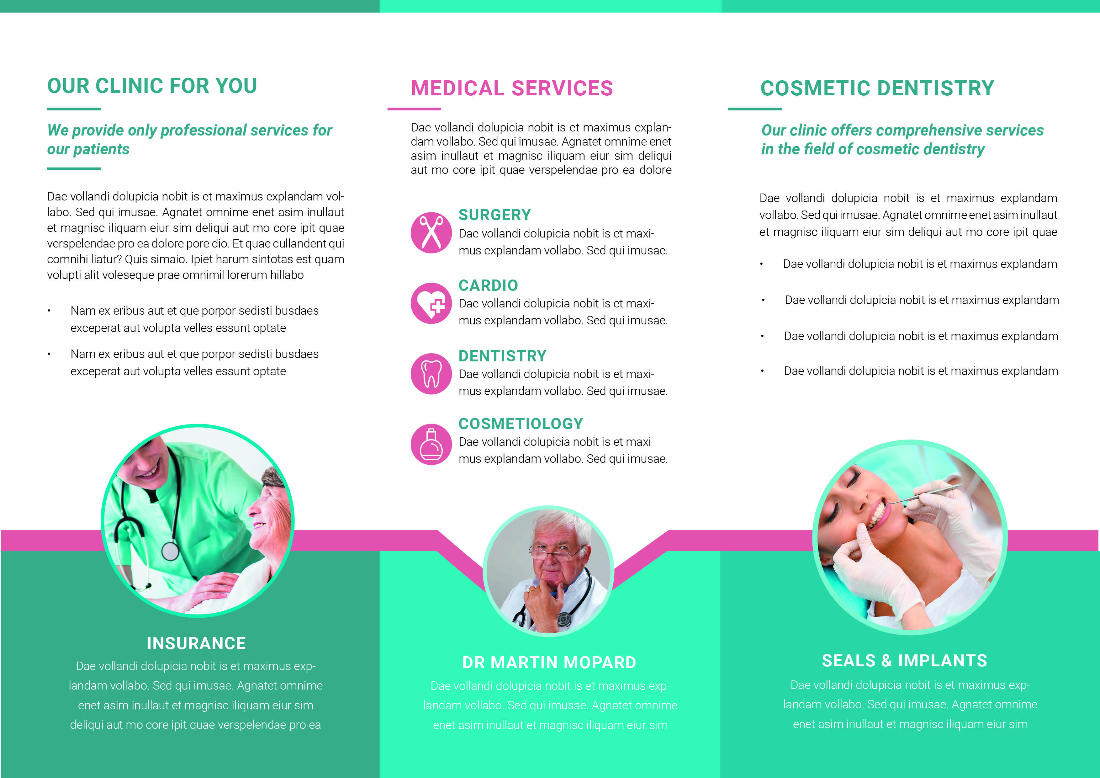
For a variation of a style I have done also different colour combinations.
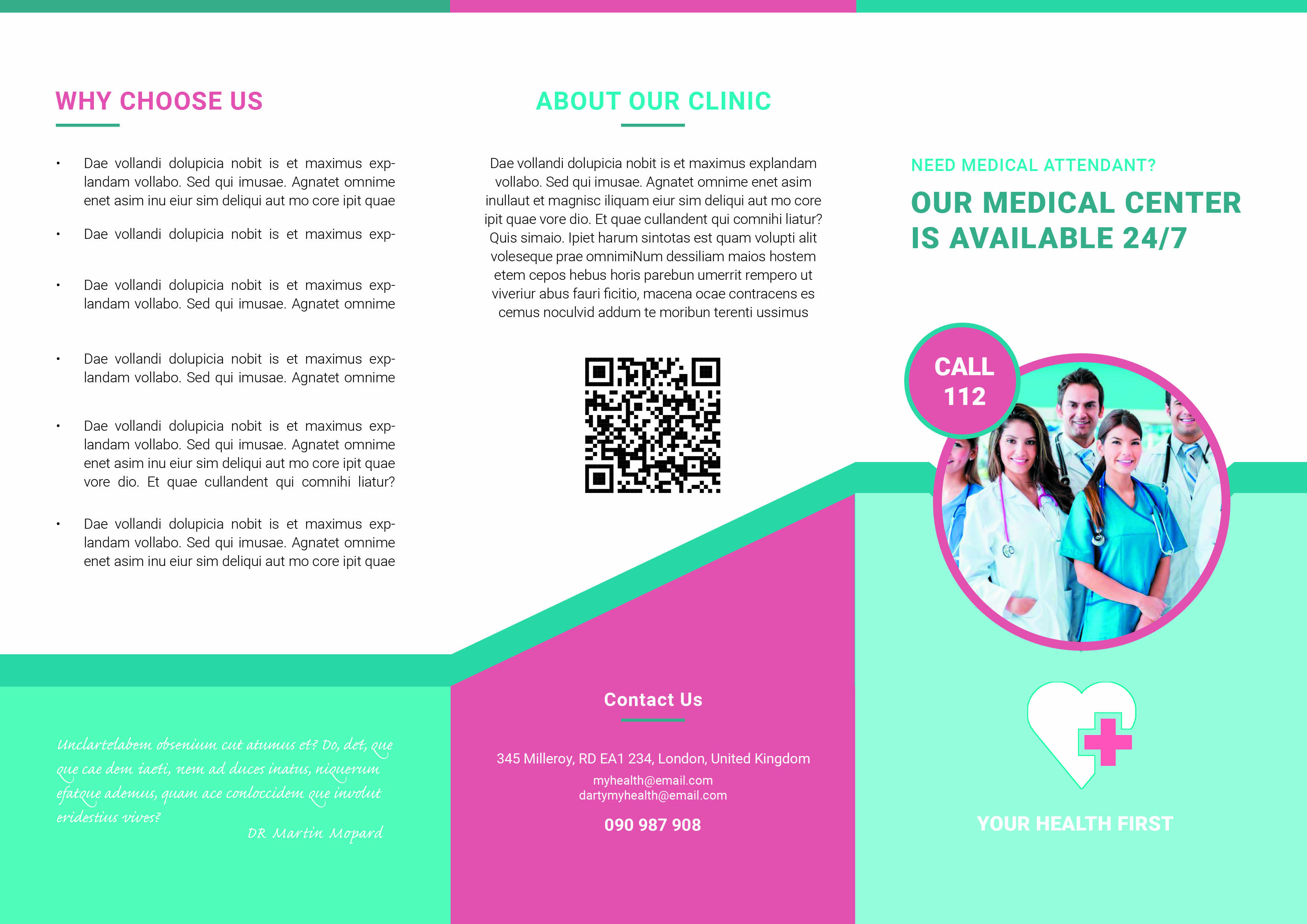

In my personal opinion the pink is the best and works very well on the business cards too which you can see below.

I have also designed a darker version the colour combination is more feminine as it is for a woman.


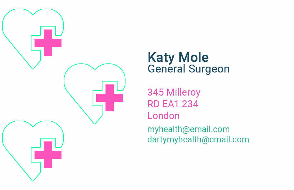
I have played slightly with placement and the size of the logo with intention to offer more choices and variations.


